Responsiblities
Game Design, Branding, Background Art, UX/UI
Overview
Monster Bombs is al web-based homerun derby game that's accessible on both desktop and mobile devices, ensuring players can enjoy it on the platform of their choice.
Game Workshop
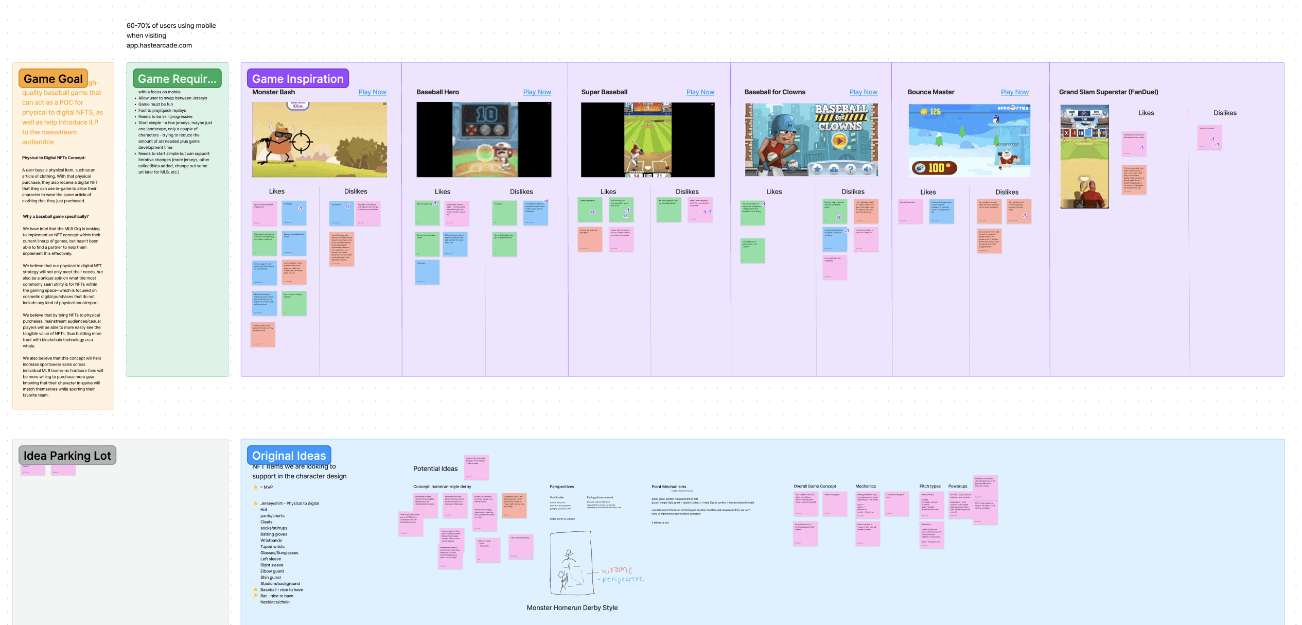
The first thing we did was a game design workshop: What were our goals? What were our requirements to meet those goals? We also gathered a ton of game inspiration and spent time playing them, making sure to note our likes and dislikes. We also began to brainstorm some original ideas.

Figjam Workshop
Mood Boarding
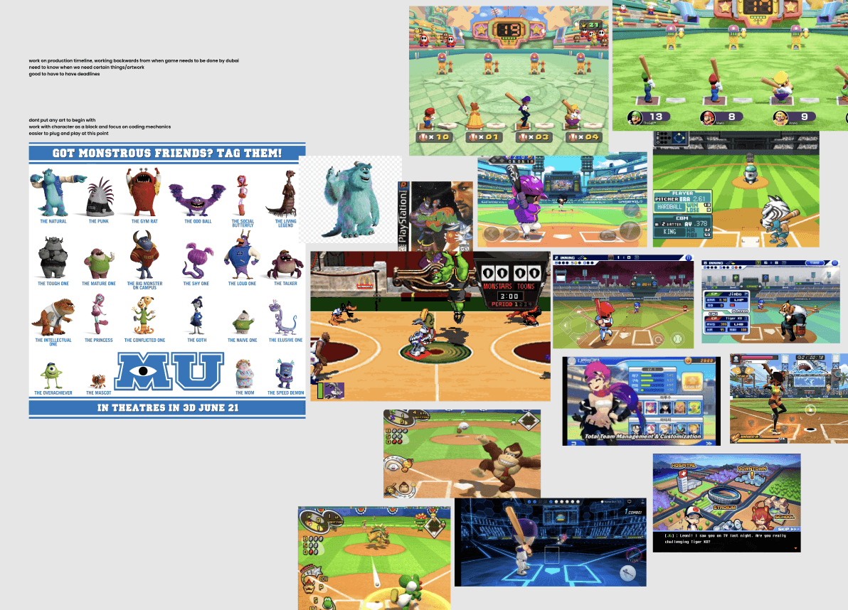
After facilitating the workshop I began mood boarding based on the original concept that we'd brainstormed: Of course the game had to be fun and engaging, so as a non-sports-person, which sports games did I have the most fun playing throughout my life? Space Jam on PS1 of course. Obvious classic.

Figma Mood Board
After reviewing these concepts with the team, we came to a consensus on the game's general direction. We wanted to go for a space theme with the main character resembling a monster. It was around this time we came up with the name Monster Bombs. With a 'bomb' being the term for a home run. With the name decided, we knew we had to build a home run derby.
Character Development
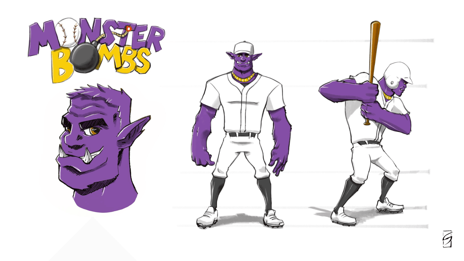
With our playable character in mind, we pulled in an artist to help develop the art and rig the animations. I art-directed the artist on what we were thinking for the character, logo, and field design. Here was the first sketch they sent to the team:

Initial Concept Sketch
We didn't have a whole lot of feedback at this point. The artist started working on our minor tweaks to the character, whom we named Tank.
Game Wireframes
Once the character was in a decent spot, I felt confident enough to dive into Figma with very simple, rough wireframes using free assets I found. The goal was to get my idea out as quickly as possible so the team could get alignment and our developer could start building.

Monster Bombs Wireframes
As with any wireframes, the intention with these was to start putting our character in actual scenes and start building out the UX/UI. All art use was meant as placeholder at this point, but it did help get the discussion going on visual ideas.
Background Art
Since we originally planned for this game to be 2D, I began building the background art for the field in Figma. I asked our character artist for a quick concept sketch of a field in outer space to get me started.

Initial Concept Sketch & WIP Field Art
I worked by tracing the sketch, and creating the visual effects/setting the tone for the overall tone and atmosphere for the scene.

"Final" Field Art + In-Game Rendering
There would be a lot more visual refinement on this field concept, but more on that later.
Logo Refinement
Once I had the stadium's vibe established, I moved on to refining the logo that our artist conceptualized.

Original Logo Concept + Logo V1
Similar to the process with the stadium art, I started by tracing the original sketch in Figma, making a few refinements along the way. Then I placed it on top of the field art on the splash screen to start playing with how the Art, Branding, and UI could all feel together.

Logo V1 + V2
I wasn't super happy with V1 of the logo once placed in context on the game's splash screen. To me it felt way too sloppy for a sports game. I decided to scratch the hand-drawn look and instead went with a typeface that gave me the sleek look I was going for.
Game Prototype
At this point we had enough for a viewable game prototype. This process happened rather quickly and is documented through videos at various stages throughout the development process. Each video was shared with the team over Slack, where we all gave feedback and discussed ideas for the next iteration.
V1
V1 Game Video
This was far from the very first video that the team received, but it was definitely the first one that was the most complete. It was at this point that we started to rethink our decision to go 2D.
V2
V2 Game Video
V2 included a pivot to a 3D game. This meant the developer had to rebuild my 2D art as 3D directly into unity, which lead to some un-ideal mismatches in style. My approach to making this a bit more cohesive without too much rework was to go back and refine the color palette and add some lighting effects that would render the scene to be more natural looking. I worked very closely with the developer to art direct the style in V3.
V3
This is the last video I have before Monster Bombs launched, because at this point the team was QAing the game by playing in a staging environment.
V3 Game Video
You can see at this stage in development that the style had changed quite drastically. We spent a lot of time paying attention to interaction effects, sound design, and debating the motion of the camera between swings.
At this stage I also introduced the idea of player health to the game to make it a little more interesting, a feature which was heavily debated amongst the team. To me this concept made the game a bit more interesting. Along with 3 strikes, your game could also end if you were not paying attention and hit too many bombs.

Onboarding + Health Bar Mocks
It was at this point I started designing out the last few UI details. We also added the concept of being 'on fire', which the player could trigger by scoring 3 home runs in a row.
Marketing Hype Video
For game launch, we worked with a marketing agency to put together a nice promo video. The visuals I established helped set the tone and pulled everything together nicely despite the hiccups. We even wrote a backstory for Tank, which was used to help bring even more depth to the game.
Hype Video
Monster Bombs can be played for free on the arcade with a Haste account- go ahead and try it out for yourself!


