project snapshot
Role | Lead Product Designer, Design System Owner |
|---|---|
Team | Design + Engineering |
Duration | 2.5 years |
Platforms | Web + Android |
Scope | 7 Applications |
Deliverables | 70+ Components, Design Tokens, Storybook, Documentation |
My contributions & outcomes
Proposed and helped establish a dedicated Design System Team
Led creation of a reusable component architecture spanning 7 applications
Championed migration from Sketch to Figma
Established documentation ecosystems for designers, developers, and stakeholders
Standardized experiences across web and Android platforms
Secured stakeholder buy-in for long-term design system investment
Business Challenge & Scope
Lineage Logistics was rapidly expanding its portfolio of voice-first warehouse applications across web and Android. Each product evolved independently, resulting in inconsistent user experiences, duplicated effort, and growing maintenance costs.
I proposed and helped establish a dedicated Design System Team to create a shared foundation of reusable components, governance, and documentation capable of supporting the entire product ecosystem.
The design system ultimately supported seven production applications spanning warehouse operations, receiving, scheduling, and workforce management.
Design System in Production

Automated Receiving - Android Mobile
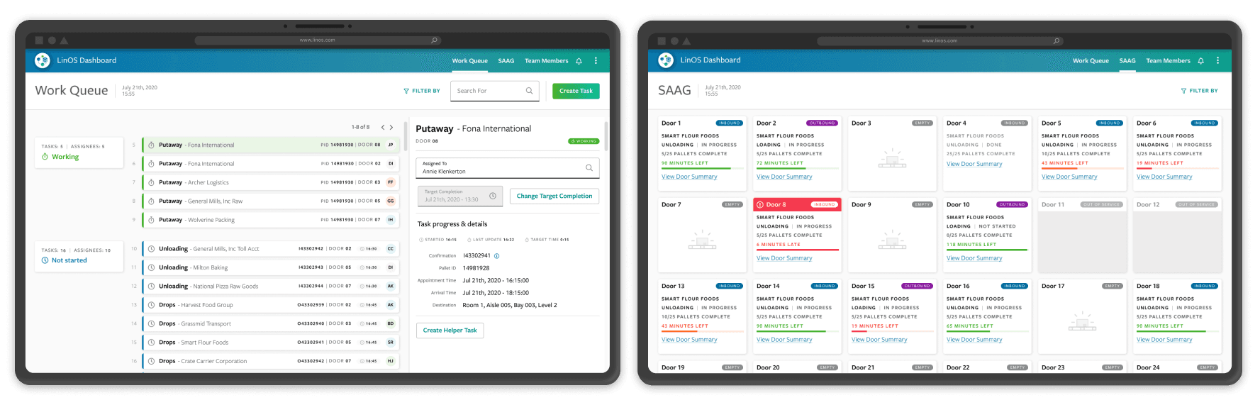
LinOS Dashboard - Responsive Web
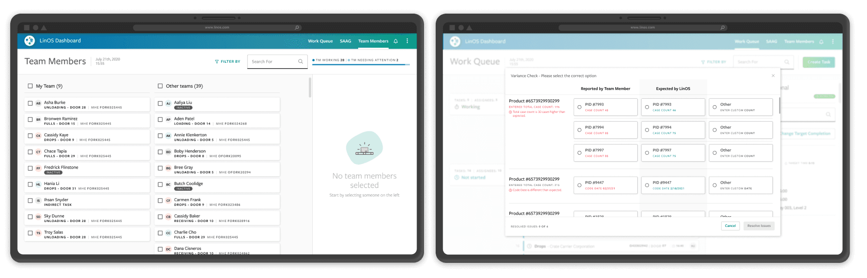
LinOS Dashboard - Responsive Web
Research & Discovery
To understand barriers to scale, I audited product workflows, component libraries, documentation practices, and development processes across the application portfolio.
Five recurring themes emerged across teams.
Key Challenges Identified
Fragmented component ownership | Front-end components lived inside application repositories, creating merge conflicts and increasing maintenance overhead. |
|---|---|
Inconsistent documentation | Teams lacked clear guidance on when to use system components versus application-specific solutions. |
Lack of design QA standards | Gaps between design and development created confusion and recurring stakeholder friction. |
Limited cross-platform reuse | Components required significant rework to support both web and Android applications. |
Design tooling couldn't scale | The team's Sketch workflow lacked the collaboration, governance, and organizational capabilities needed to support a growing design system. |
These findings shaped the design system strategy and informed the priorities for Phase 1 of implementation.
Strategic Approach
After evaluating several approaches, I selected Brad Frost's Atomic Design methodology because it provided a scalable framework for organizing components across multiple products while supporting future growth.
Together, Atomic Design and a centralized Figma ecosystem provided the organizational foundation needed to scale component development across teams and platforms.
I championed and led the migration from Sketch to Figma, enabling real-time collaboration, centralized governance, and more efficient cross-functional workflows.

Internal presentation used to align stakeholders around component architecture and system governance.
Scaling Adoption Across the Organization
To ensure long-term adoption, I focused on five parallel initiatives:
Initiative | Approach |
|---|---|
System Roadmap | Prioritized component development based on active product needs and portfolio requirements |
Documentation | Built comprehensive guidance for designers, developers, and stakeholders |
Education & Mentorship | Trained cross-functional teams on design system principles and implementation best practices |
Feedback Loops | Conducted surveys and gathered ongoing feedback to identify improvement opportunities |
Governance & Adoption | Established processes to align design, development, and business stakeholders |
Documentation Ecosystem
To support adoption across the organization, I established a multi-platform documentation and communication ecosystem tailored to the needs of designers, developers, and stakeholders.
Platform | Audience | Purpose |
|---|---|---|
Figma | Designers | Component specs, usage guidance, patterns |
Storybook/Bit | Developers | Interactive implementation references and component APIs |
Confluence | Organization | Governance, onboarding, setup guides, team processes |
Slack | Organization | Design system support, announcements, and adoption updates |
Each platform served a distinct audience, ensuring guidance was accessible where teams already worked.

Internal documentation standards covering file organization, component structure, design tokens, and developer handoff workflows.
Results & Impact
Over the course of the initiative, LinOS evolved from a collection of loosely connected design patterns into a scalable cross-platform design system adopted across seven enterprise applications. Through governance, documentation, education, and reusable architecture, teams were able to work more consistently while reducing the operational overhead of maintaining independent UI solutions.
70+ Components | 7 Applications | 7 Teams | Cross-Platform |
|---|---|---|---|
Reusable Components | Applications Supported | Team Alignment | Web + Android |
Adopted across seven production applications supporting both web and Android platforms.
What Changed
Before | After |
|---|---|
Product-specific UI patterns | Shared component library |
Independent design files | Centralized Figma ecosystem |
Application-owned components | Dedicated design system ownership |
Fragmented documentation | Multi-platform documentation strategy |
Organizational Impact
Established a dedicated Design System Team supporting 7 concurrent applications
Aligned seven product teams around a common design language and implementation approach
Created a shared governance model for component development and maintenance
Design Impact
Standardized UI patterns across web and Android applications
Reduced duplicate design effort through reusable components and patterns
Reduced time spent recreating common UI patterns, allowing designers to focus on solving user problems
Development Impact
Reduced maintenance overhead and merge conflicts by separating component development from application repositories
Centralized component ownership and maintenance
Provided reusable implementation resources through Storybook and Bit
Adoption & Enablement
Built a multi-platform documentation ecosystem supporting designers, developers, and stakeholders
Established ongoing feedback loops, training, and mentoring programs
Increased organizational confidence in design system adoption
Lessons Learned
Lesson | Takeaway |
|---|---|
Design for the edge case first | Early device audits prevent costly redesigns later in the implementation process. |
Adoption requires enablement | Documentation, training, and communication are as important as the components themselves. |
Tooling decisions have organizational impact | Platform choices should be evaluated not only for capability but also for implementation and maintenance cost. |
Explore the Figma Design System
Explore the complete production design system including component specifications, design tokens, usage guidance, and implementation references.
" width="16.000001271565907px"/></svg>)