project snapshot
Role | First Full-Time Product Designer |
|---|---|
Team | Design, Engineering, & Product |
Duration | 1 year |
Platform | Web |
Focus | Platform UX, Form Builder, Information Architecture |
Impact | Created platform foundations for structured publishing workflows |
Why this project matters
PubPub Platform represented a shift from simple publishing tools toward a configurable platform capable of supporting complex academic publishing workflows.
As the team's first full-time designer, I established the design practice, led feature discovery, established reusable product patterns and foundational design system conventions, and partnered closely with engineering to translate abstract data structures into interfaces users could understand and manage.
Business Challenge & Scope
PubPub Platform enabled academic publishing communities to create structured content models, submission workflows, and publishing experiences without custom development.
I joined during a critical transition as the team migrated from the original PubPub—well-loved by users but limited to basic styling customizations—to PubPub Platform, a more powerful version designed to address the architectural, data-specific, and workflow management needs of high-value publishing clients who required deeper customization capabilities.
While the platform included many interconnected publishing workflows, this case study focuses on the Form Builder—the primary interface communities used to structure and collect content.
Research & Discovery
The discovery process for this feature required a deep understanding of what a 'Form' meant to both Knowledge Futures stakeholders and users. This concept was spearheaded by KF's Head of Product, and when I began work, a rudimentary developer prototype was already in place.
I worked to understand the problem the team was trying to solve through Forms and how this concept related to the smaller JSON schemas users were creating. After interviewing team members and key users, I researched products with similar functionality—primarily Google Forms and Contentful—as starting points for ideation.
Primary Challenges
Challenge | Why it Mattered |
|---|---|
Ambiguous terminology | Teams used "Form" to mean several different concepts |
Complex mental models | Users needed to understand abstract data structures |
Evolving requirements | Core requirements were undefined at project start |
Technical constraints | UX decisions were constrained by platform architecture |
Translating System Architecture into User Experience
Design Principles
Reuse familiar interaction patterns whenever possible
Expose complexity progressively
Align terminology across stakeholders and users
Validate concepts with developers and customers early
Mapping the Content Model
Before designing the Form Builder, I needed to understand how Forms fit into the platform's broader content model.
• A 'Pub' represented a single piece of content
• Each Pub was assigned a Type that determined its available fields
• Types were collections of specific fields
• Forms were designed to help communities manage variations of Types more easily
The data hierarchy flowed: Fields → Types → Forms → Pubs
Below is a quick diagram I drew to share with my Lead Developer to ensure I had appropriate understanding of this data hierarchy:
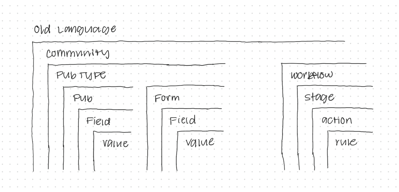
PubPub Platform Data Hierarchy Notes
To ensure a smooth rollout, I built upon UX patterns already familiar to users throughout the platform. This consistency-first approach reduced cognitive load for users while allowing developers to focus on the feature's core functionality rather than new interface paradigms.
Designing the Form Builder
Let's explore the mockups for the Form Builder by following a user's path through the feature from start to finish.
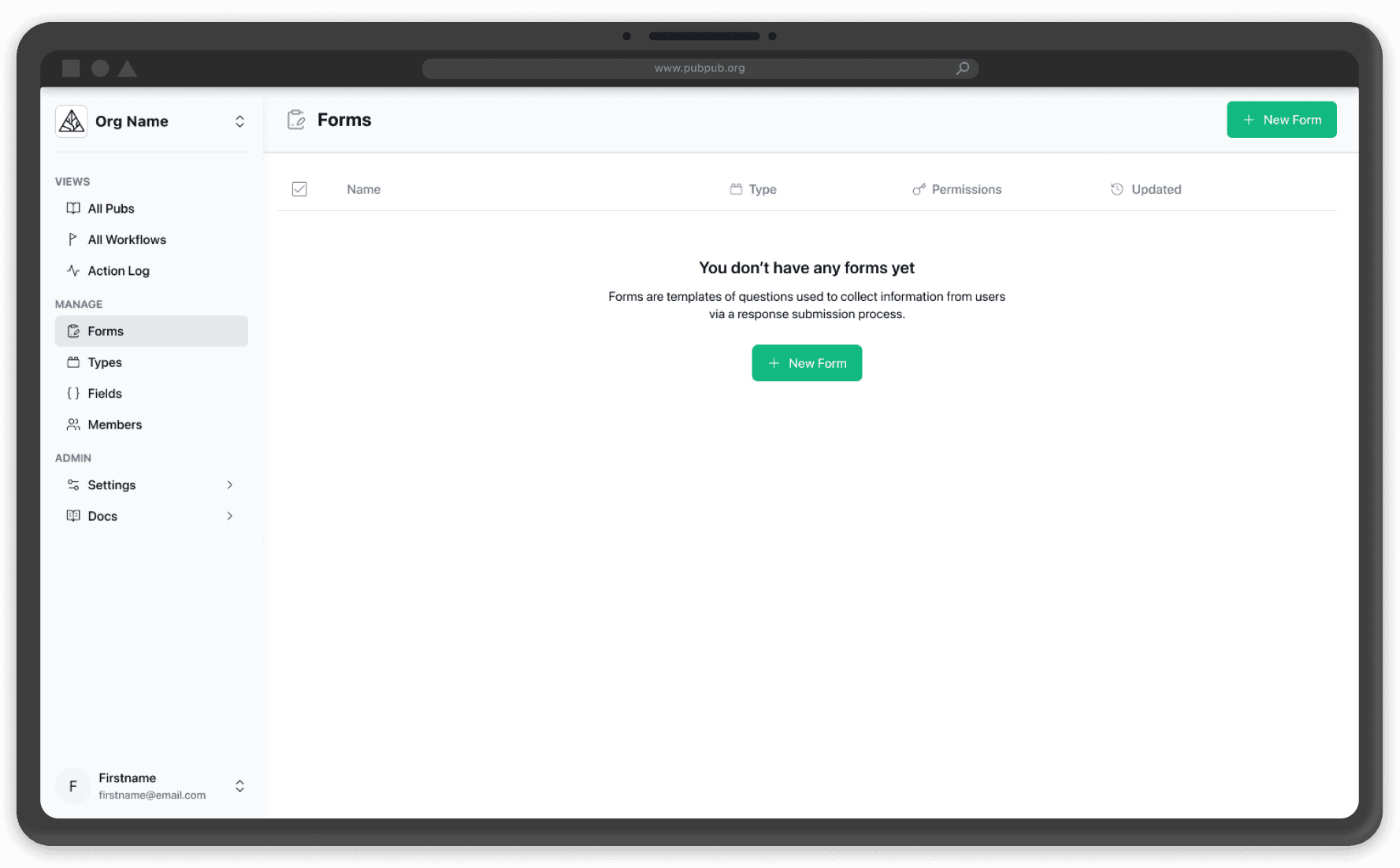
Forms Landing Page
This page appears immediately after users create a Type. I kept the design minimal to focus on explaining Forms within the broader application context.
The main challenge was concisely communicating the distinction between internal Forms (used by community members to create and edit existing Pubs) and external Forms (used by outside contributors to create new Pubs through submission).
While this solution provided a foundation for user testing, the primary feedback indicated that the explanation felt too generic, revealing several areas for future iteration.
Create a Form

Create a Form
Design challenge: Users needed to understand how a Form related to existing content structures before creating one.
For creating a new form, I leveraged an existing modal pattern from elsewhere in the application to collect essential form configuration details.
Each field included clear explanations of its purpose and impact, helping non-technical users understand what to expect from their choices.
Build a Form
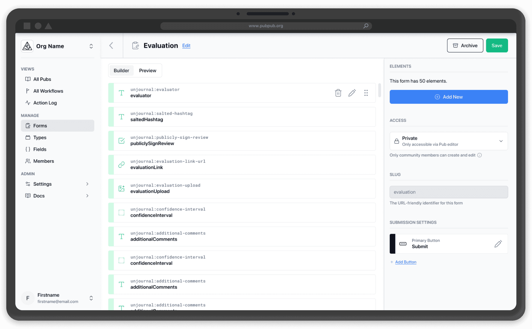
Build a Form
Design challenge: Users needed flexibility without breaking the integrity of the underlying Type system.
Upon creating a form, users were taken to the Form Detail page, which displayed fields pre-populated based on the Type selected in the previous modal.
Each field appeared as a card showing essential information at-a-glance. Users could drag to reorder these fields as they pleased, or add additional fields beyond those defined in the Form's canonical Type.
This approach balanced consistency with flexibility, allowing communities to tailor forms to their needs without abandoning the underlying Type structure.
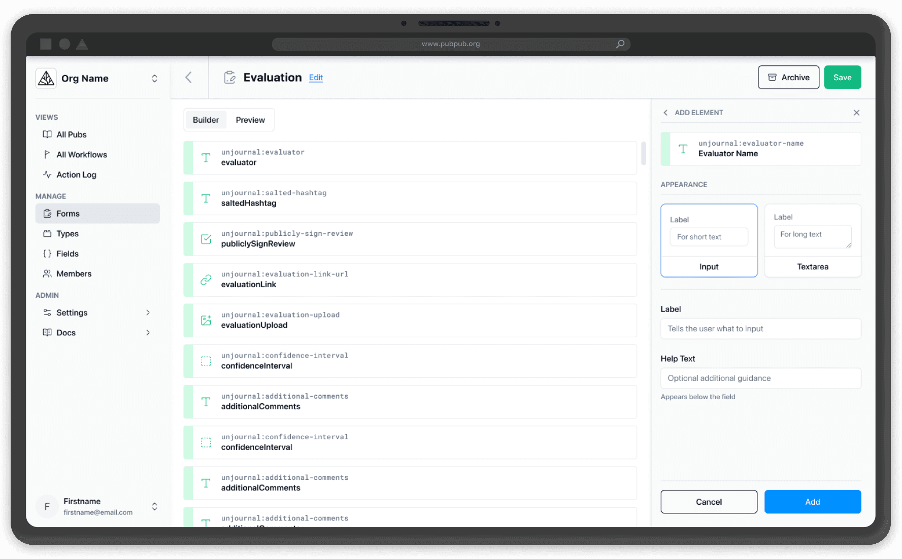
Add a Field

Add a Field
Design challenge: Users needed access to a large field library without feeling overwhelmed.
If a user chose to add a new field, they would be shown all available fields from their community's field library.
Configure Fields
Configure Fields
Design challenge: Users struggled to understand how schema configuration translated into real user experiences.
When configuring or editing a field, users saw appearance options showing how the field would display in the final form interface.
Recognizing this as a crucial step in helping users understand how their JSON schemas would translate into actual UI elements, I made the descriptions extra detailed to help users choose the most appropriate form elements for their content collection needs.
Preview the Experience
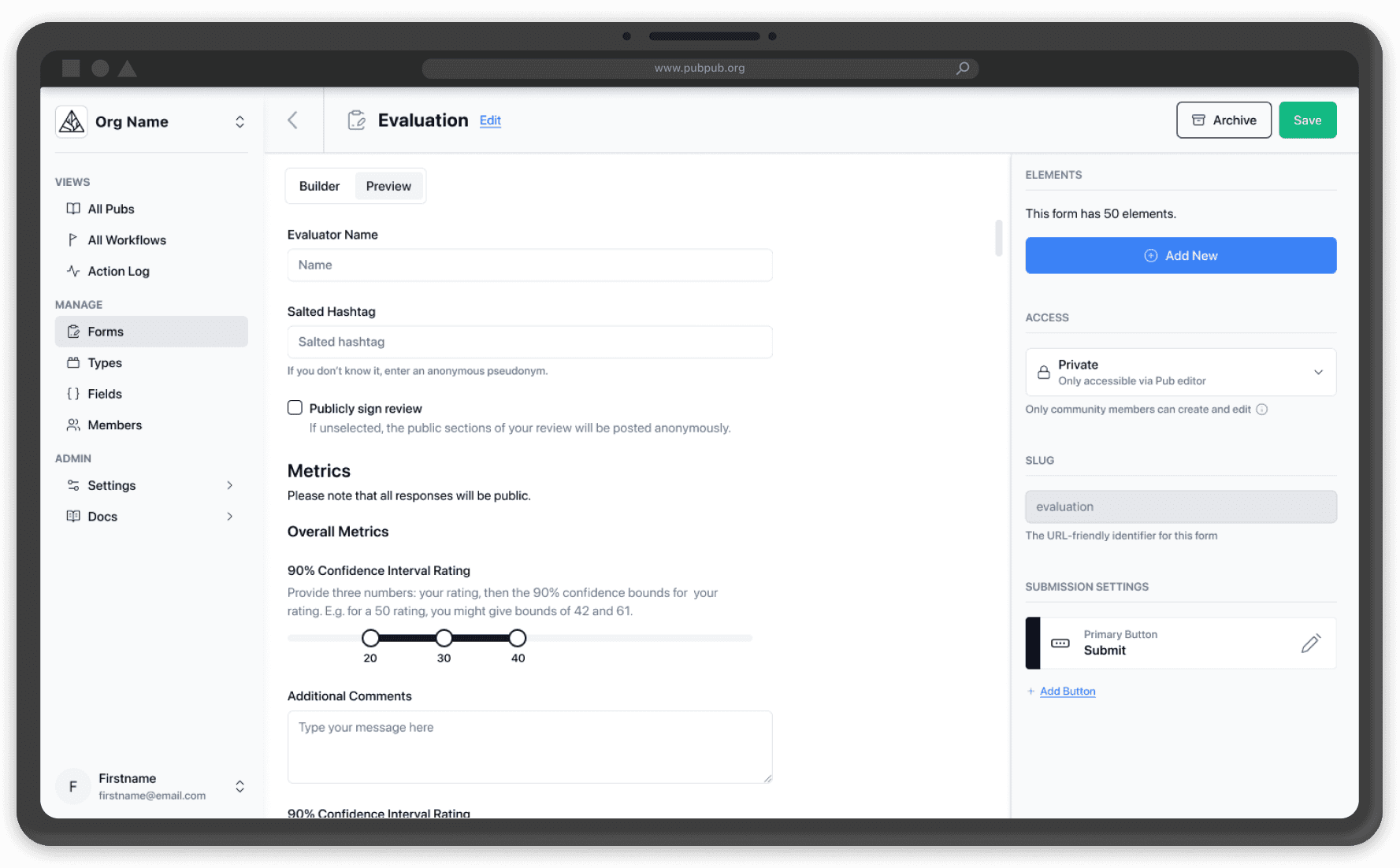
Preview the Experience
Design challenge: Users lacked confidence that their configurations would produce the intended experience.
Anticipating that the form builder could be overwhelming for new users, I advocated for implementing a preview feature to help users create better forms and collect higher-quality content.
We decided not to include previews in the MVP, but it became our most requested feature from external users during testing. Fortunately, having already designed the mockups made implementation straightforward for our second iteration.
Results & Impact
First Dedicated Designer | New Platform Capability | Reusable Product Patterns | Platform Strategy Advanced |
|---|---|---|---|
Design Practice Established | Form Builder Delivered | Shared UX Patterns | Enabled Structured Publishing |
Product Impact
Introduced Form Builder as a core platform capability supporting structured content creation
Reduced complexity by translating abstract publishing architecture into understandable workflows
Established reusable interaction patterns later leveraged across the platform
Influenced the second iteration roadmap through validated concepts such as form preview functionality
Team Impact
Served as Knowledge Future's first full-time designer, establishing foundational design processes and collaboration practices
Created a shared language between product, engineering, and stakeholders around complex platform concepts
Validated a Lean UX workflow that enabled rapid iteration and continuous feedback
Built confidence in design-led product development, creating a foundation for future design initiatives
Strategic Impact
The Form Builder established a foundational capability within PubPub Platform, enabling publishing communities to structure content and submission workflows at scale. User feedback consistently highlighted the value of the feature's intuitive approach to managing complex data relationships.
Beyond immediate workflow improvements, the project reinforced the platform's broader strategy around structured content reuse and scalable publishing infrastructure. Internally, it demonstrated the value of design as a strategic function and helped establish the processes, collaboration models, and reusable patterns that supported future product development.
Lessons Learned
Designing for Complex Systems
Working through this feature provided deep insights into PubPub Platform's core purpose and strategic direction. The process revealed numerous technical constraints that shaped my understanding of designing within an Entity Component System architecture.
Below is a screenshot I shared with my lead developer while working on the Form Builder to understand how user data would ultimately interconnect within the system. This deep technical understanding proved essential for creating scalable solutions that could adapt to diverse use cases within the platform.
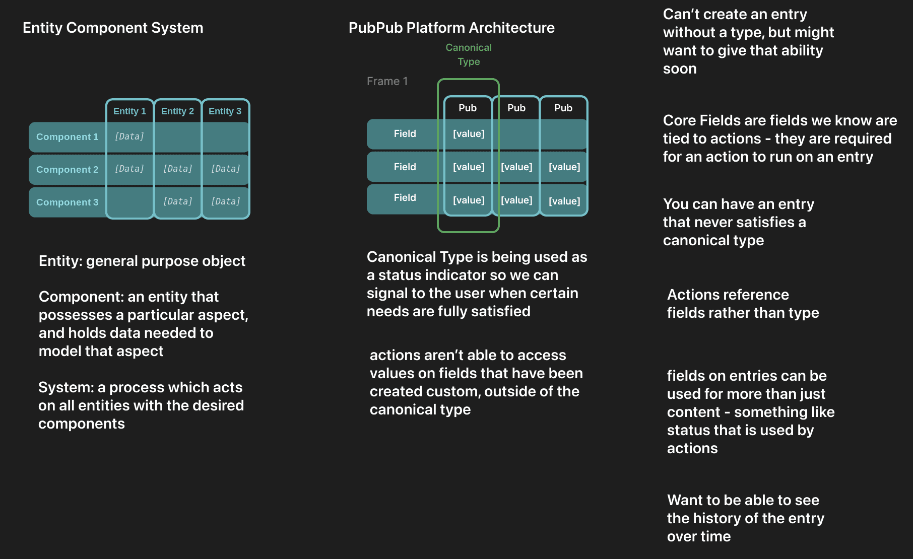
My Figma Notes on ECS and how the concept translated to PubPub Platform
Discoverability vs Configuration
Another key lesson involved the placement of customizable submission buttons, which users frequently overlooked or forgot to configure.
The current placement made this critical element easy to miss. If I were to redesign this feature, I would treat the submission button as a permanent, non-movable field pinned to the bottom of the form, ensuring users couldn't overlook this essential step in their workflow.
I would also recommend making submission buttons discoverable through the 'Add Element' menu, providing an alternative pathway for users who prefer that interaction pattern.
" width="16.000001271565907px"/></svg>)