
Role | Senior Product Designer | Design Systems |
|---|---|
Company | Bank of America |
Timeline | 2026 - Present |
Team | Enterprise design systems, with accessibility and engineering partners |
Focus | Cross-component pattern discovery, team alignment, accessibility, and reusable component definition |
Status | Discovery complete; component and pattern definition in progress |
Tools | Figma, Microsoft Copilot |
Product teams needed a consistent way to control the state of multiple related items, beginning with expanding and collapsing collections of content. Similar solutions had emerged across the design system, but differences in placement, labeling, behavior, and accessibility created ambiguity for both users and implementation teams.
The opportunity was initially framed as an Expand all/Collapse all component. Through discovery, I identified a broader need for shared guidance around collection-level actions, raising the question of whether the original request represented a reusable cross-component pattern.
Discovery
A similar interaction already appeared across multiple components, but there was no shared guidance governing its behavior, placement, naming, or implementation. Before designing a solution, I needed to determine whether it should be treated as a component-specific feature, a reusable interaction pattern, a shared component, or some combination of the three.
Distinguishing Pattern from Component
I began by separating the interaction from its visual implementation. Components define a specific interface object, including its structure, appearance, states, and properties. Patterns define a reusable solution that can span multiple components and establish when it should be used, which behaviors should remain consistent, and what accessibility expectations apply.
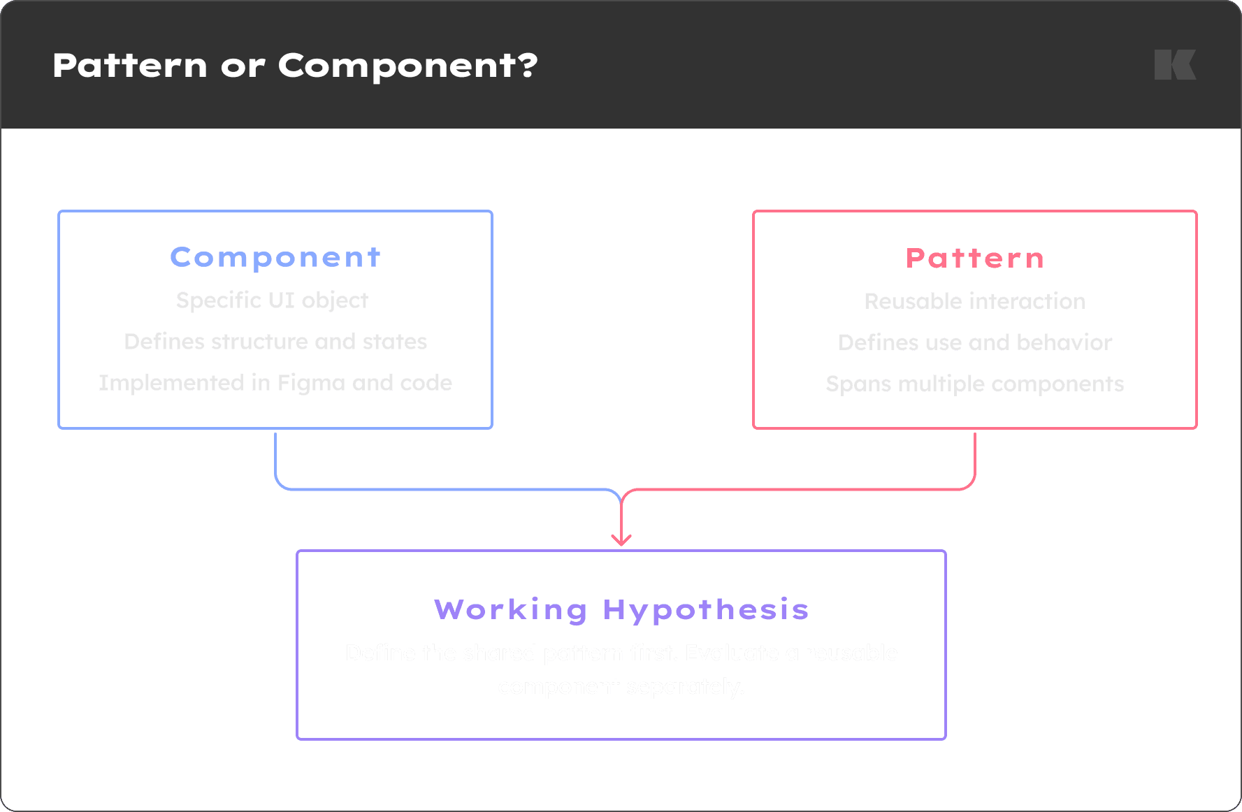
Distinguishing a Pattern from a Component
The interaction appeared across different component types, supported the same group-level user goal, and remained conceptually consistent even when its visual treatment changed. This led to a working hypothesis: the behavior should be treated as a cross-component pattern, while the value and form of a reusable implementation should be evaluated separately. I brought that hypothesis to the design-system team for critique rather than treating it as a predetermined solution.
Auditing the Existing System
I mapped how the interaction currently appeared—or could potentially be supported—across accordions, expandable cards, tables, and related disclosure components. For each component, I documented its existing configuration, placement guidance, group-control support, documentation coverage, and potential changes.
The audit exposed uneven support across the system. Some components already included the behavior and documented its placement, while others required teams to construct their own solutions or offered no guidance at all. This created variation in both implementation and the resulting user experience.
Deconstructing the Interaction
Looking beyond individual components revealed a shared structure: one group-level control changes the state of a collection of related items, while each item continues to maintain its own state.
Defining this underlying model helped separate the persistent user need from any particular interface treatment. It also provided a foundation for evaluating which components could participate in the pattern without tying the solution exclusively to accordions.
Using AI to Broaden the Research
Because the interaction was inconsistently named and rarely documented as a standalone pattern, conventional searches produced limited results. I used Microsoft Copilot within the organization’s approved environment to explore related terminology, surface candidate examples from public design systems, and identify additional questions for investigation.
AI accelerated the initial search, but it did not determine the findings. I reviewed the original sources, excluded examples that were not meaningfully comparable, and evaluated the remaining systems against a consistent framework covering behavior, placement, control model, visual treatment, and accessibility guidance. I then synthesized the evidence into the working hypothesis and open decisions that guided the next phase.
AI Accelerated | Designer Judgement Established |
|---|---|
Terminology exploration | Source verification |
Example discovery | Relevance and context |
Questions to investigate | Comparison criteria |
Breadth of research | Findings and recommendations |
Comparing Established Approaches
I evaluated the public design-system examples against a consistent set of criteria: group behavior, visual treatment, placement, control model, accessibility guidance, and notable implementation decisions.
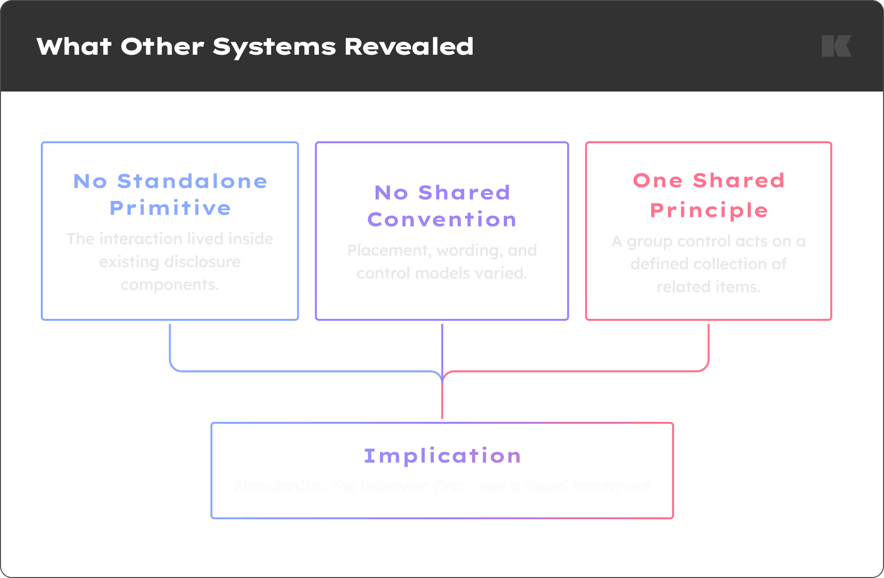
Primary findings from comparing established approaches.
The comparison showed that no system exposed the interaction as a standalone primitive. Most documented it within an existing disclosure component, but their implementations differed considerably. Some used two persistent actions, while others used a single control that changed with the current state. Placement, terminology, and visual treatment also varied.
Despite those differences, the examples shared one important principle: the control acts on a defined collection of related elements.
What Discovery Established Before Team Review
The behavior represented a cross-component interaction pattern rather than a feature inherently tied to one component.
Existing implementations offered no universal convention for placement, naming, or control model.
Shared guidance could reduce local design decisions and improve consistency across participating components.
The research narrowed the remaining questions to pattern scope, participating components, reusable implementation, control model, and accessibility behavior.
With the opportunity defined and the key decisions isolated, I brought the recommendation to the design-system team for critique and alignment.
Turning Research into Team Decisions
The initial FigJam captured the full audit, competitive analysis, accessibility questions, and pattern-versus-component reasoning. While comprehensive, it was too dense to support a focused team discussion.
I reorganized the research into a concise presentation path: the problem, current Helix state, external findings, evidence, recommendation, and decisions needed. Detailed research remained available as supporting material, but the primary path focused the conversation on the decisions the team was prepared to make.
I presented the recommendation to product designers and an accessibility specialist, using the research to facilitate alignment rather than asking the team to review the audit artifact independently.
Recommendation
I recommended defining a broader Group controls pattern for collection-level actions, beginning with Expand all/Collapse all and potentially extending to Select all/Deselect all.
The pattern would establish shared rules for appropriate use, naming, placement, state behavior, accessibility expectations, and participating components. I also proposed exploring a reusable implementation without assuming that every component could share the same technical structure.
Team Alignment and Decisions
Question to Team | Decision |
|---|---|
Pattern or component-specific feature? | Define a cross-component Group controls pattern |
Expand/Collapse only or broader scope? | Establish the broader Group controls framework |
Guidance only or reusable asset? | Provide a standalone Figma component with documented use cases |
Which components participate first? | Accordion, Accordion Progress, and Expandable Card |
One changing action or two actions? | Retain two persistent actions |
The discussion validated the broader pattern direction and confirmed that Helix should support it with a standalone Figma component. It also changed my proposed sequence.
My initial recommendation prioritized defining the complete pattern before committing to a reusable asset. The team chose to begin with the component and its immediate use cases, then use those decisions—along with existing component documentation—to structure the broader Group controls guidance.
From Recommendation to Phased Delivery
Phase 1: Define the component
Create a standalone Group controls component in Figma
Support two persistent actions
Define its use across Accordion, Accordion Progress, and Expandable Card
Document appropriate and inappropriate use cases
Phase 2: Define the broader pattern
Consolidate existing guidance from participating components
Standardize naming, placement, state, and usage rules
Evaluate how related actions such as Select all/Deselect all fit the pattern
Validate accessibility expectations with accessibility partners
Still to validate: State announcements, mixed-state behavior, focus expectations, universal versus component-specific accessibility guidance, and whether any implementation can eventually be shared in code.
Interim Outcome and Next Steps
The discovery reframed a component-level request as a broader systems opportunity and gave the team a shared model for collection-level actions. The resulting recommendation aligned the team around a Group controls pattern, a standalone Figma component, an initial set of participating components, and a persistent two-action model.
The work is now moving into component definition and accessibility validation, with a clear implementation scope and a shared framework for expanding the pattern over time.